
Capital Order Typography
Capital Order Typography
Capital Order Typography
Project Type:
Modular Typeface Design
Project Type:
Modular Typeface Design
Programs:
PhotoShop
Illustrator
Programs:
PhotoShop
Illustrator
Themes:
Birmingham Design Festival [BDF]
Roman Architecture
Corinthian Order
Themes:
Birmingham Design Festival [BDF]
Roman Architecture
Corinthian Order
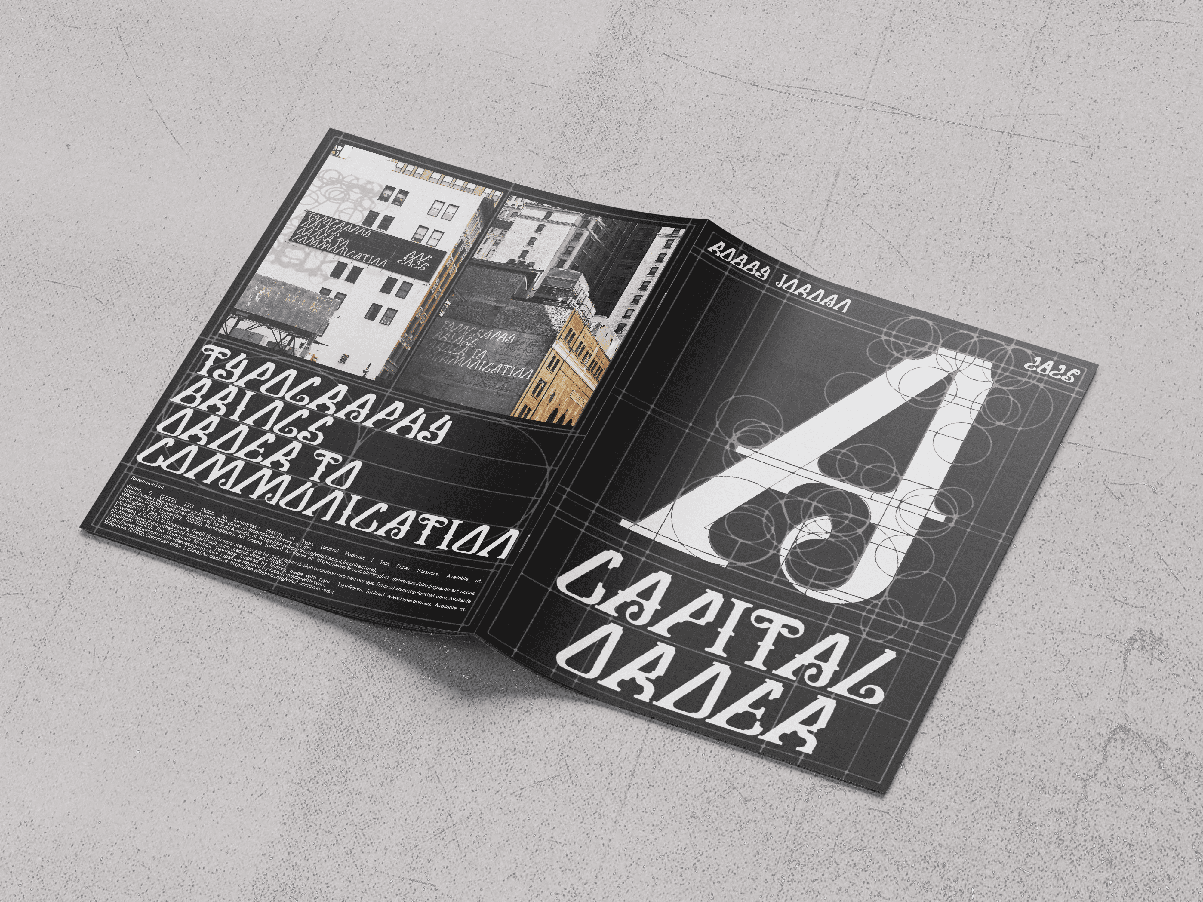
I was tasked with creating a typeface for the 2025 Birmingham Design Festival. I researched and designed around the Birmingham Town Hall, where the festival was held, studying and playfully ideating around the buildings architecture and history. Coming up with three initial concepts and combining elements from all three into a final outcome.
I was tasked with creating a typeface for the 2025 Birmingham Design Festival. I researched and designed around the Birmingham Town Hall, where the festival was held, studying and playfully ideating around the buildings architecture and history. Coming up with three initial concepts and combining elements from all three into a final outcome.


Concept 1#
Concept 1#


Concept 2#
Concept 2#


Concept 3#
Concept 3#
Combining the 3 Concepts together
Combining the 3 Concepts together


I’ve circled my favourite design. I’ve chosen this one for its consistent vertical stroke width and its sharp triangular counter, resembling the triangular roof of the Birmingham town hall. It features a prominent arch underneath the letterform's crossbar, a design seen repeated across the pedestal base of the Town Hall.
I’ve circled my favourite design. I’ve chosen this one for its consistent vertical stroke width and its sharp triangular counter, resembling the triangular roof of the Birmingham town hall. It features a prominent arch underneath the letterform's crossbar, a design seen repeated across the pedestal base of the Town Hall.
I’ve circled my favourite design. I’ve chosen this one for its consistent vertical stroke width and its sharp triangular counter, resembling the triangular roof of the Birmingham town hall. It features a prominent arch underneath the letterform's crossbar, a design seen repeated across the pedestal base of the Town Hall.


The flourish on the 'A' shares resemblance to a volute, a scroll like ornament found on the column’s capital, this was perfect as it both complimented the architectural character of the typeface and also stays consistent to the Birmingham Town Hall's exterior.
The flourish on the 'A' shares resemblance to a volute, a scroll like ornament found on the column’s capital, this was perfect as it both complimented the architectural character of the typeface and also stays consistent to the Birmingham Town Hall's exterior.


Incorporating the modular grid into the typography's personality
Incorporating the modular grid into the typography's personality


First page
First page
I continued this modular constructive blueprint styled design onto my specimen poster to further push its architectural theme.
These thin sharp lines that cover the poster apply closure, proximity and similarity principles to help keep visual harmony within the poster.
I continued this modular constructive blueprint styled design onto my specimen poster to further push its architectural theme.
These thin sharp lines that cover the poster apply closure, proximity and similarity principles to help keep visual harmony within the poster.


Second & Third Page (Double Page Spread)
Second & Third Page (Double Page Spread)
Alphabet, Numbers, 6 punctuation marks and a 200 word type specimen
Alphabet, Numbers, 6 punctuation marks and a 200 word type specimen


Fourth Page
(Mock-ups & Quote)
Fourth Page
(Mock-ups & Quote)
Typography brings order to communication
Typography brings order to communication
Type Specimen Poster
Type Specimen Poster


